Same company.
Different decision.
Case 01

Development agency, SRB
Diligent Software
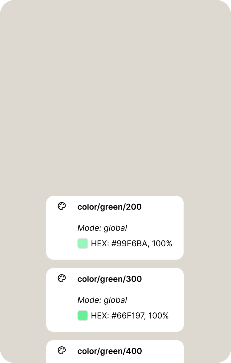
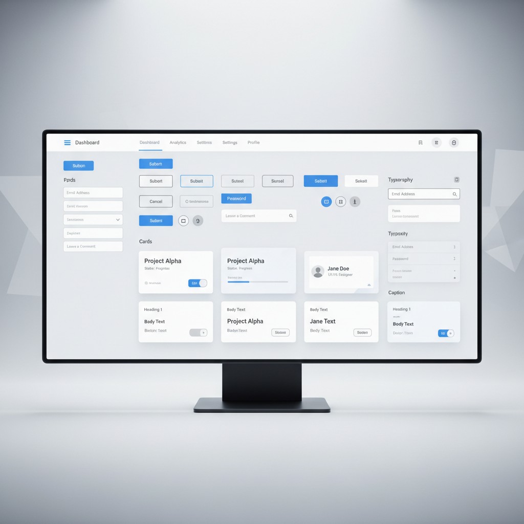
They didn't want a new mark, and they were right to keep it. We modernised the symbol rather than replacing it and built the first real system around it — colour, type, photography, graphic elements, written down. Then the site, end to end.
Acquired within a year of the relaunch.
"We didn't want to start over, and Moku understood that immediately. They kept the mark and built a real system around it - something we'd been improvising for years without one. The site was the last piece, not the whole project."

— Stefan Djordjevic, Diligent Software
Case 02
B2B lead-gen agency, Geneva
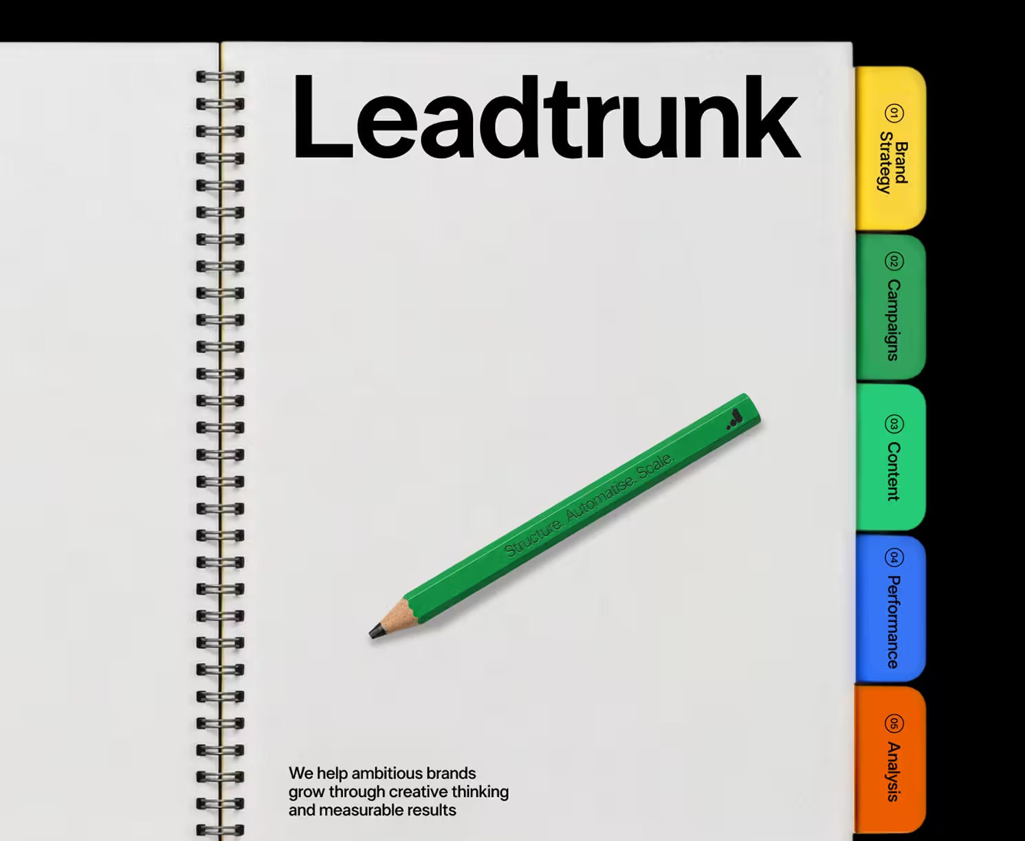
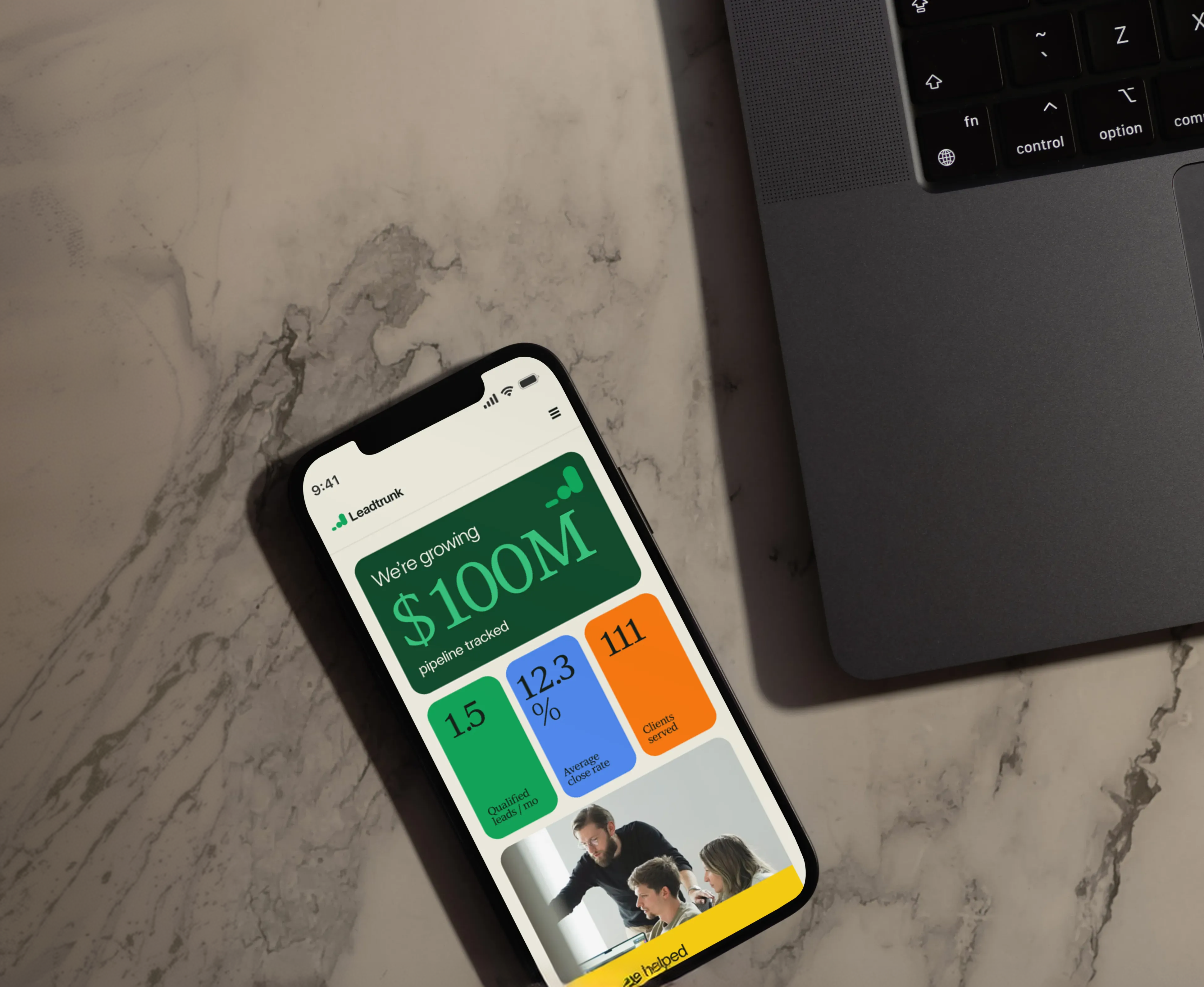
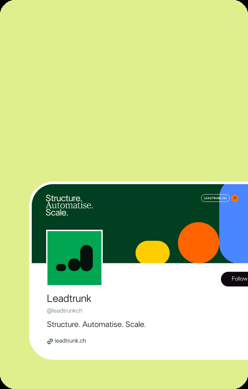
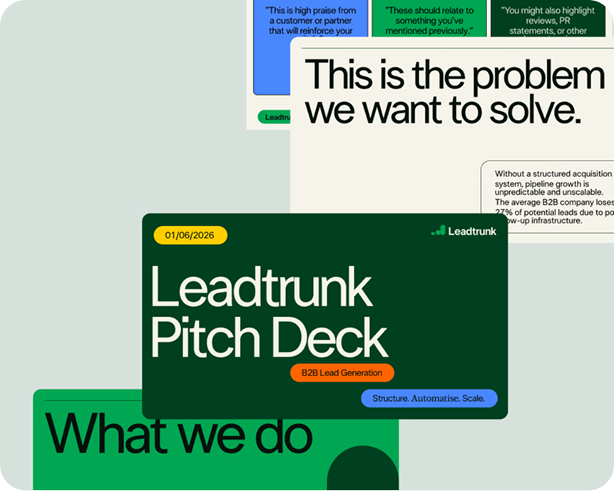
Leadtrunk
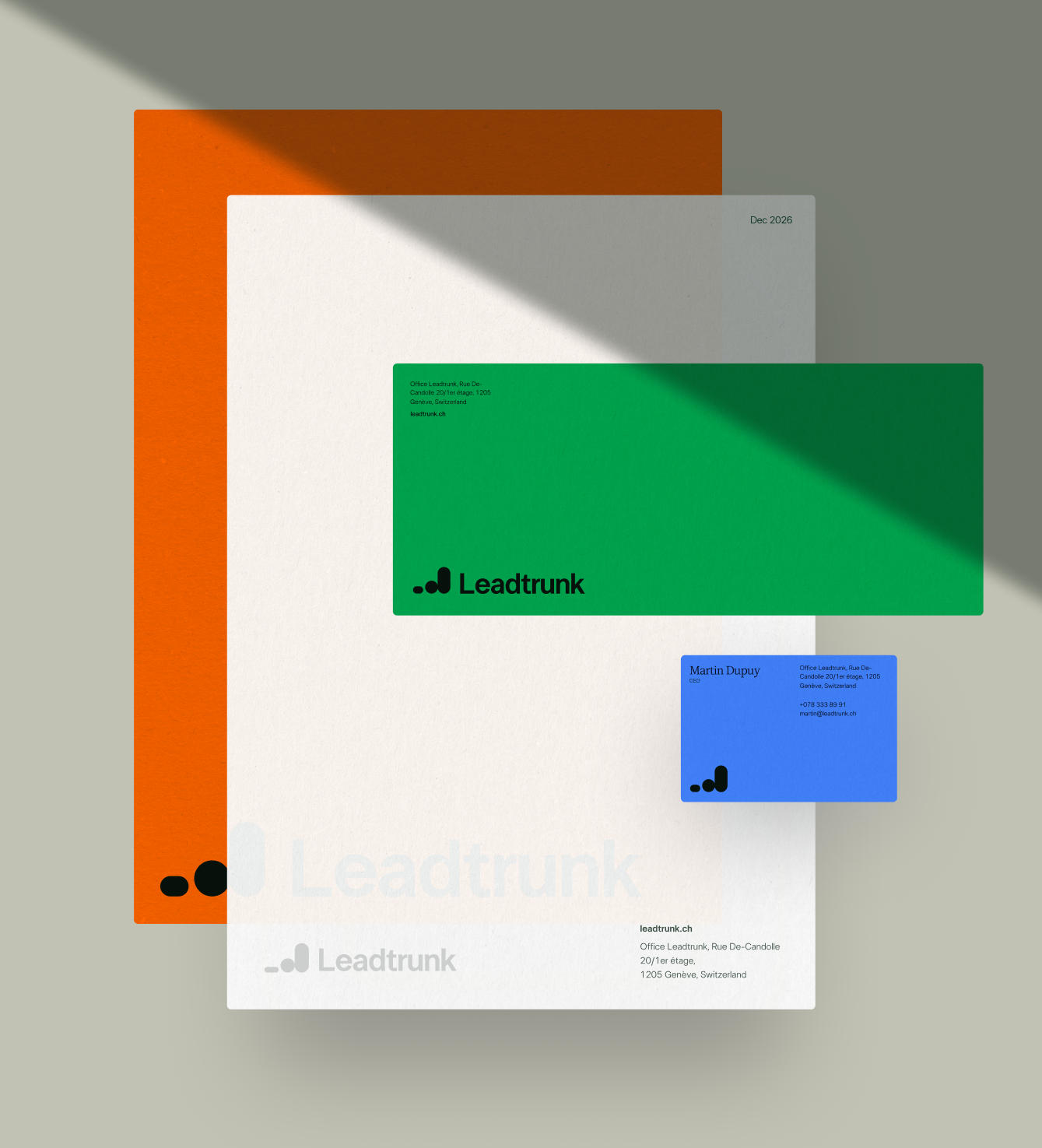
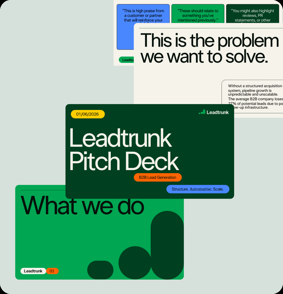
Client came in with a palette and a chart-based logo worth keeping. We kept those and rebuilt everything else around them — type, photography, graphic elements, layouts, written down for the first time. Then seven pages of website.
"She did much more than simply deliver visual assets. From the start, she took time to understand our positioning, our objectives, and the stage of development of our company..."

— Mélanie Lesbros, Leadtrunk
Case 03
Marketing & creative agency, SRB
Webni
We came to Moku with a logo and not much else. She didn't just fix that — she gave us a reason to sound like ourselves instead of everyone else in the category.
“We came to Moku with a logo and not much else. She didn't just fix that — she gave us a reason to sound like ourselves instead of everyone else in the category.”

— Radivoje Stevanovic, Webni